Morrisons Bistro
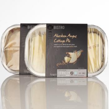
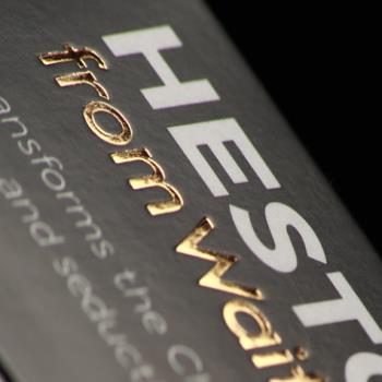
A leading supermarket’s premium own-brand range was given a bistro feel with quality finishes. The brief As part of its ‘good, better and best’ product tiering system brand review, Morrisons was looking to launch its new ‘M Kitchen’ range into stores as part of a relaunch of the store’s own brand products. Graphic Packaging International was tasked with a brief to create packaging that reflected chef inspired food that is restaurant quality but great value. What we did Graphic Packaging International's Integrated Packaging site completed the original proofing of three artwork variants and two varnishes from files received from Morrison’s artwork house. Our technical team suggested that Morrisons leave silver sections unvarnished due to the small size of the area to enable the lustre of the colour to show through. Morrisons agreed to this idea and Graphic Packaging International completed print trials. When a satisfactory sample was agreed by the client, Graphic Packaging International produced around one hundred proofs so that Morrisons could supply its printers with the approved print colour standard. This ensured consistency of print across the range, no matter which supplier printed the packaging. The product The finished Bistro sleeve packaging has striking aesthetic appeal in store. The use of spot varnish, black on black, stands out and catches the consumers eye. The lustre of the silver ‘Bistro’ text works with the rest of the packaging to create a premium look. The extra mile Colour consistency was guaranteed across the range by using the Graphic Packaging International Colour Management System, GMG proofing system and by calibrating all colour measuring equipment. This was particularly important for the Bistro range where different lines were being produced at several of the Graphic Packaging International’s production facilities.Visit the Graphic Packaging website for more information on Morrisons Bistro

