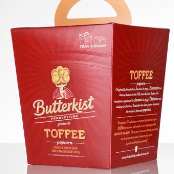
Butterkist Toffee Popcorn
The nation’s best-loved popcorn brand increased the visual impact of cartons with Graphic Packaging International’s unique constructional design. The brief Butterkist popcorn was rebranding its entire range, Graphic Packaging International was asked to create a carton design that would match the new designs in the popcorn family of products. The bag-packs in the range were printed onto silver polyester featuring an eye-catching metallic ‘sunburst’ effect created by the use of the silver backing and the strong red brand colour. The carton print finish had to mimic this effect. What we did Graphic Packaging International engaged with the customer and design agency right from the start of the project, providing various solutions using offset lithographic printing. Graphic Packaging International engaged with a local reprographics company to build press files of proofs of different variants. From these the customer and design team were able to see how their brief would look compared to the flexible packaging designs, and we were able to show how different ink, repro files and varnish finishes would impact the design and ultimately give the right look. The product By using a special colour match and printing over silver ink, Graphic Packaging International’s print team kept the colour scheme in line with the brand colours. Our Ink Manager worked with the Reprographics and Print teams to achieve a very transparent shade, underpinned with silver to give a metallic look in the critical areas. Clever reprographics were created to introduce subtle tones of black to create the ‘sunburst’ effect the designers were looking to achieve. The crashlock tapered carton was designed with a integral carry handle feature for consumer convenience. A concorra tear strip was placed around the carton as an easy open feature and to turn the carton into a more traditional popcorn bucket for the consumer to decant the popcorn into. The extra mile The final carton pack gives the same visual impact as the flexible packs with the metallic finish, making the re-branding consistent across the different packaging types. The carry handle and concorra opening not only make the pack easy to use, but bring a point of difference to the product category.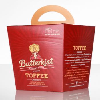
Visit the Graphic Packaging website for more information on Butterkist Toffee Popcorn
ENQUIRY FORM